
Second Harvest of the Big Bend is a client that I had the opportunity of working with during my time as a web designer at BowStern Marketing Communications. Second Harvest is a nonprofit that helps address the urgent hunger problem in the 11 counties surrounding the Tallahassee, Florida region, known as the Big Bend. They came to BowStern looking for a redesign of their logo and help with rebranding. As part of the cross-functional design team at BowStern, I was tasked with developing a solution to their branding problem. I was honored when they chose my logo to represent them in their work.
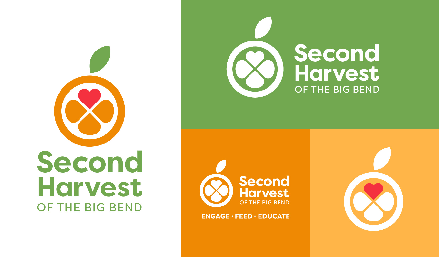
The logo takes its signature shape from one of Florida’s most iconic fruits, the orange. Three orange segments reflect Second Harvest of the Big Bend’s mission statement to feed, educate, and engage the community to help end hunger in the Big Bed region. The heart represents the passion that drives the community members who dedicate their time and effort to Second Harvest.
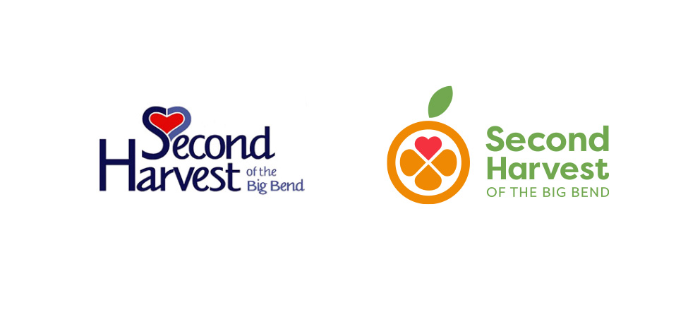
Second Harvest had been using their previous logo for many years and it was recognizable in the Big Bend community. In an homage to that recognition, I retained the heart and reshaped it to fit in with the segments of the orange. It was the only thing that was carried through to the new design, as they were eager for a full departure from their previous branding.
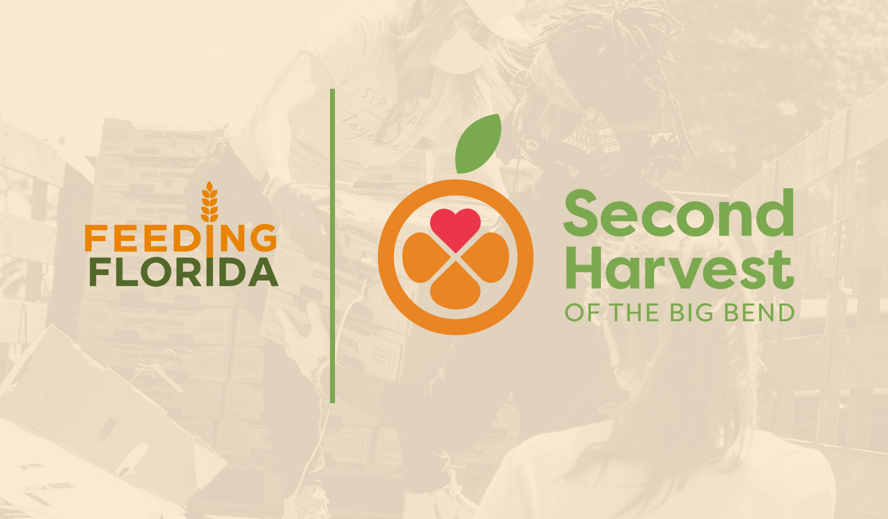
As a member of Feeding Florida and Feeding America, Second Harvest frequently uses their logos in tandem with their own. Colors were deliberately chosen to blend well with the Feeding America family, but bit of originality was retained in the colors. The client felt it was important for their brand to stand out from the massive network of charities under the "Feeding" umbrella. The orange and green are brighter, and lighter, but still lend themselves to the family of brands.
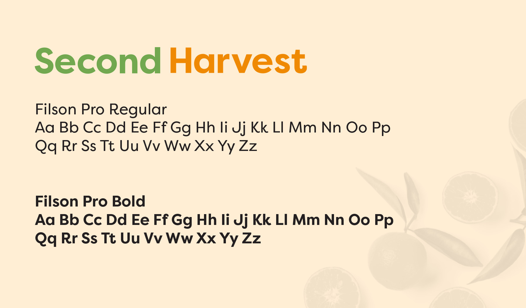
Filson Pro is a versatile, geometric sans serif font designed by the Mostardesign Type Foundry. The curved terminals and tails give Second Harvest a friendly and approachable aesthetic, while the geometric shape feels modern and almost youthful.
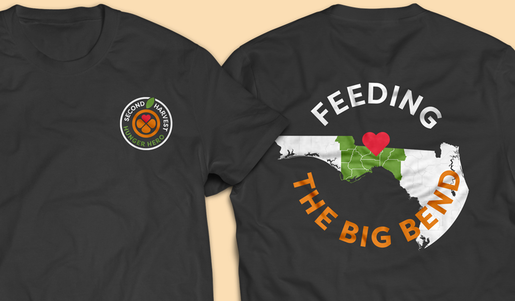
A tee shirt design for volunteers that utilizes a badge lockup and highlights the Big Bend region that they serve.
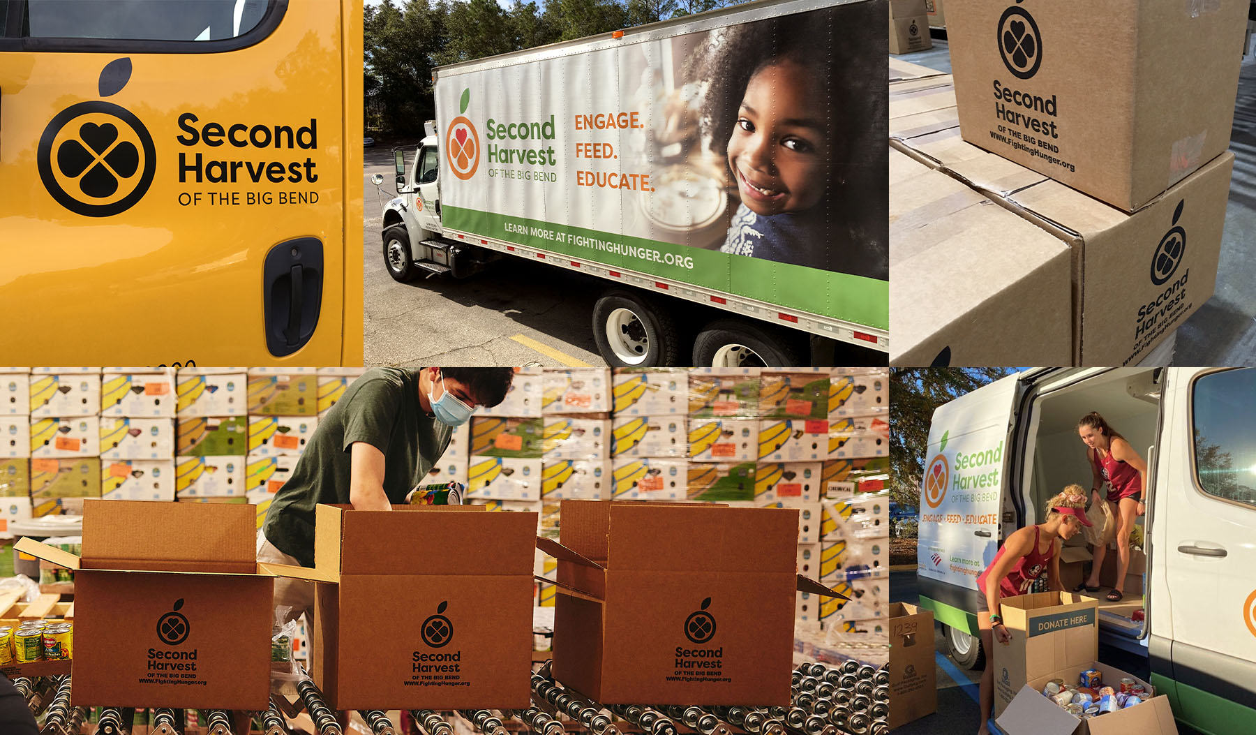
Nothing more satisfying than seeing a design you made ten feet tall on the side of a truck filled with hundreds of boxes that have that same design printed on them!
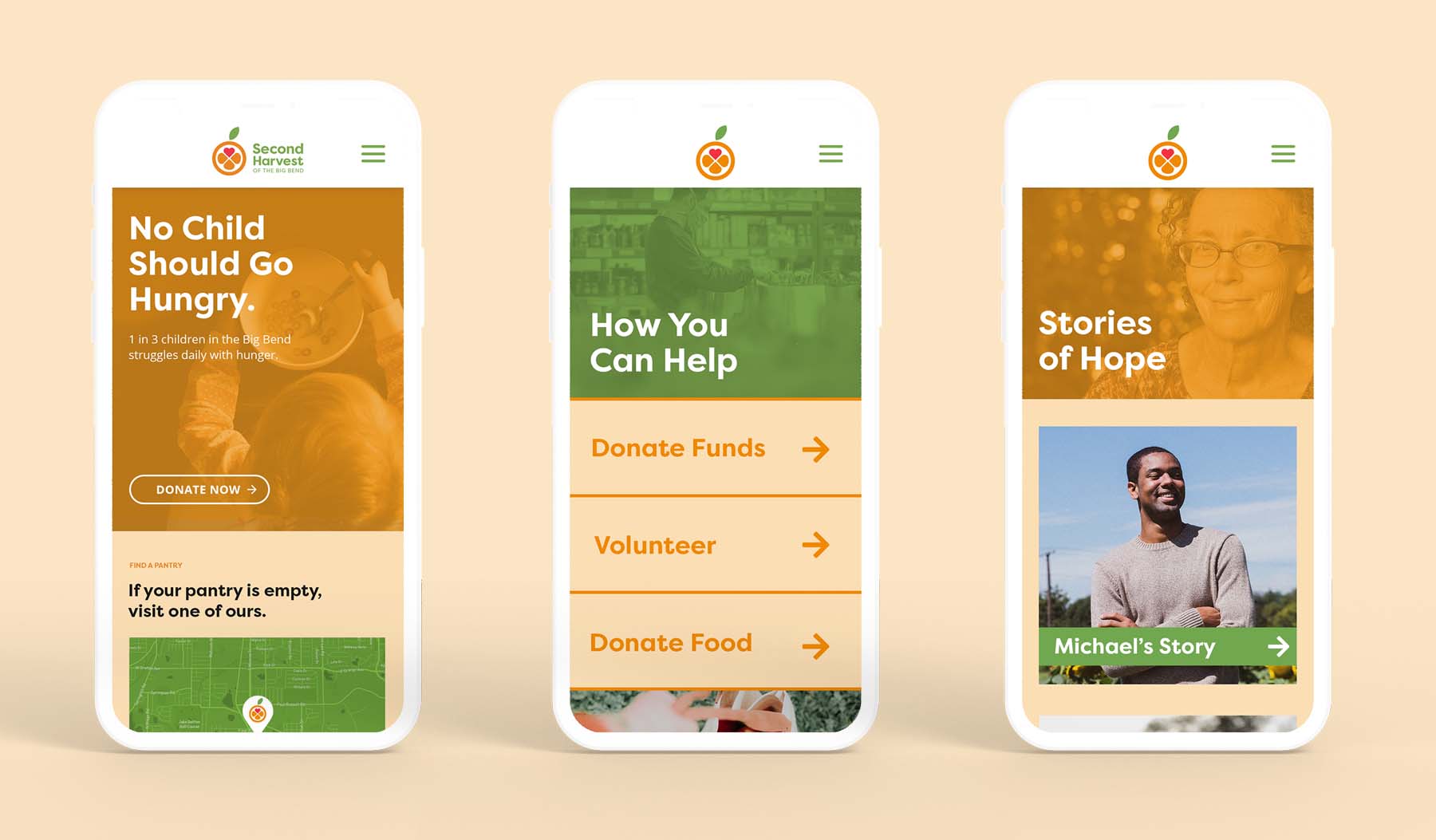
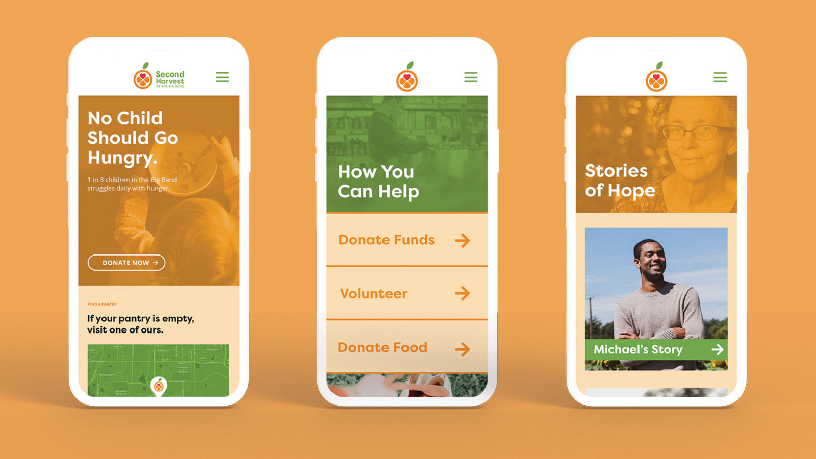
While a website redesign was not within our scope, I had fun envisioning what their homepage could look like if I had been given the opportunity to extend the brand in this way.